This is the story of the Seattle music scene of the 90s, Throwback Thursday, and some beautiful data visualisations.
Throwback Thursday
This all started on a Thursday.
Each week we have someone nominated to post their Throwback Thursday pick to our team Slack channel. It’s one of those ‘team things’ that everyone looks forward to.
When it was my turn recently I posted “Temple Of The Dog – Hunger Strike.” It’s one of my 90s favourites by Chris Cornell from Soundgarden and Eddie Vedder from Pearl Jam before they were huge in their respective bands.
and then I went down a rabbit hole …
- Temple of the Dog was started by Soundgarden’s Chris Cornell as a tribute to his former roommate Andrew Wood, the vocalist of Mother Love Bone, who died of a heroin overdose in 1990 just before the release of their first album.
- Mother Love Bone featured two future Pearl Jam members, Stone Gossard and Jeff Ament.
- Chris approached them with the intention of releasing a couple of songs he wrote as they were figuring out how to continue without Andrew. Jeff and Stone were trying to recruit members to form a new band and eventually found two of them, one being Eddie Vedder.
- Chris insisted on making them part of the project. So this was a supergroup before any of these bands achieved any substantial mainstream success.
- Pearl Jam would release their first album one year later and Soundgarden was just starting to get some attention.
- The video was directed by Paul Rachman who did the Alice in Chains video ‘Man in the Box’
- I don’t know why Eddie is singing from the bushes but he has said he hates singing to camera and you can see this in future videos and appearances where he avoids the camera.
- Before they both passed in 2017 Chris would perform this song with Chester from Linkin Park
But … more interestingly …
Seattle Band Map
To illustrate the collaborations, band member swapping and community that exists in the Seattle Music scene there is the Seattle Band Map.
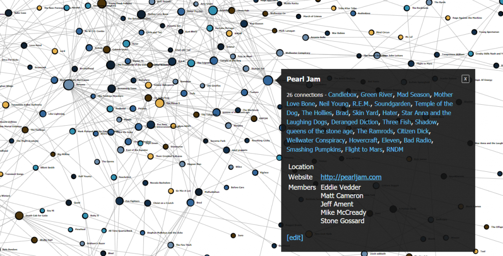
This open-source data project was started back in 2009 and illustrates the connections between bands in the Pacific North West going back in the 1960s. It was originally mapped by hand on a 4-metre sheet of paper with 3500 nodes representing a band.
LivePlasma
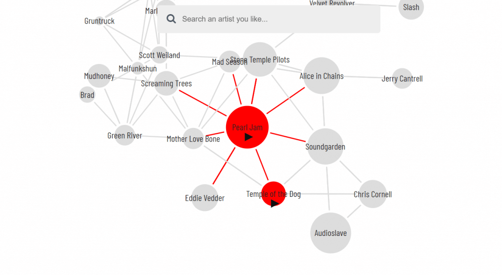
Taking this idea one step further is LivePlasma. This visualisation uses the Amazon API to connect similar bands with the aim of encouraging discoverability. Useful if your Spotify Discover Weekly isn’t doing it for you right now.
100 Years of Rock in Under a Minute
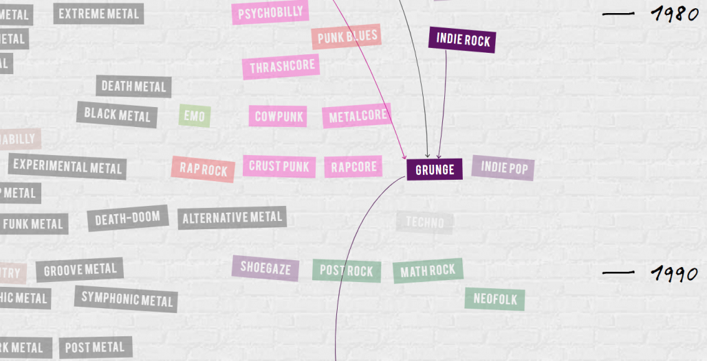
Taking the concept one step further again, the 100 Years of Rock in Under a Minute project visualises the connections between genres. I had no idea there were so many sub-genres of ‘Metal’.
Google Music Timeline
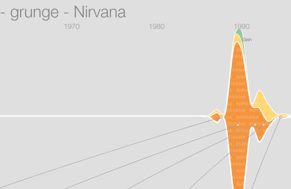
If Google Music is more your thing you can see the popularity of Albums and Artists on their platform with this visualisation built in D3 and Closure.
History of Rock in 100 Songs
Silicon Valley Data Sciences visualisation is also built in D3 and Backbone.jsThis project explores the connections between bands and the energy in their songs.
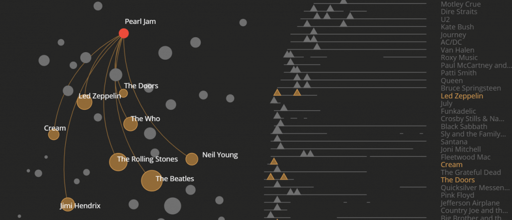
Great visualisations don’t have to just be bar charts and business data. They can be works of art, tools to tell stories and connect the dots as they have here between my favourite bands.
Useful Links
- Information is Beautiful
- Visual Cinnamon
- Interactive dashboards with D3
- What Makes a Good Visualisation?
Photo by Sebastian Ervi from Pexels


Comments are closed, but trackbacks and pingbacks are open.