Entity-Relationship Diagrams (ERD) are a way to visualise relationships between tables and the common keys between them. On first glance, they may look like a spaghetti mess.
This post hopes to demystify the language and how they fit together with the help of Sonic the Hedgehog.
Conceptual data model
Logical data model
Physical data model
What do the circles and arrows mean?
Which systems can we model?
How do we start?
In this example, I’ll be using data from my favourite Sega Master System game, Sonic The Hedgehog 1 and illustrating how the zones, acts, and boss levels fit together.
Conceptual data model
Level one!
The conceptual data model, this is a high-level overview of the different entities in the model and their relationships.

In our example, we show that in Sonic the Hedgehog 1, zones can have many acts, these levels may have special stages, may have bosses, but there is only one Boss per Zone.
This model features entities, the rectangles. This is a physical thing, a fact or an event. The relationships between these entities are shown with diamonds.
Logical data model
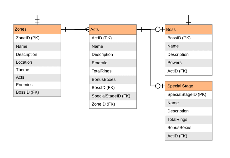
Next up … The logical data model which adds more details to our model.

In this diagram, we add the relationships between the tables using crows foot notation (more on that in a little bit) and add primary and foreign keys to show exactly how they are related.
Physical data model
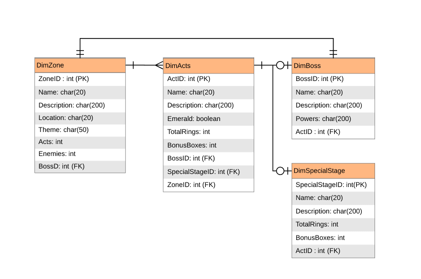
And finally … the physical data model, that shows how the model will actually be implemented.

This features the data types and names of the tables in our database. In this case, all the tables record attributes so are dimensions.
What do the circles and arrows mean?
This is called crows foot notation and shows the relationships by using a ‘crows foot’, line or circle on either side of the line connecting the entities.

Which systems can we model?
Structured data in relational systems. We need to be able to see relationships in the form of tables, columns and keys.
How do we start?
Lucid Chart does a great job of making it easy to map out your diagram when you are ready to publish, but there are many tools out there to help you get started.
The very best way to get started is with a low tech option. Get out a pen and a big piece of paper. Make this your first step before you open the tools. Plus it will get you away from your screen for a little bit. Good luck!
Photo by Ivan Samkov from Pexels


Comments are closed, but trackbacks and pingbacks are open.